NEWS

Food Font, a Growing Collection of Over 1200 Food Letters Are Now Available to Use

The Food Font project is officially launched and promotion to let people know about the project has begun.

Here is information from the official press release:

Want to play and write with your food? Ever wish you could express your thoughts and ideas in kale, vending machine food, or in summer vegetables? Food Font is an interactive art project where people can make alphabets out of food, take pictures of each letter, and later use these and other food alphabets to make images and designs.

Baumlier intends for the Food Font activity and tool to be used by a variety of groups. “This is something that farmer’s markets, community gardens, teachers and students in the classroom, restaurants, and a group of friends or family can do,” Baumlier noted. The project supports dialogue and builds community around food, health, and sustainability.

Food Font’s Beginnings

In the past 2 years, Baumlier has done over 15 public events at various locations in Ohio, North Carolina, Wisconsin, Pennsylvania, and New York where visitors created letters out of local in-season ingredients. The artist behind the project is Kristen Baumlier, an interdisciplinary artist who is based in Durham, NC. For several years Baumlier has been doing projects that explore food and sustainability. When asked how the project started, Baumlier said that, “I was doing work in my studio where I was photographing words and letters out of food. I realized that this process had potential to be fun and an interactive way to promote discussion and build community around food.”

How It Works

On the Food Font website there are resource materials for organizing a Food Font event; materials for teachers; and resources to help you make a food alphabet or organize your own Food Font event. The Food Font alphabets are free and available for anyone to use in the form of printed .pdf files, editable Microsoft Word files, and as jpeg file that you can use with free online collage tools. Baumlier hopes that the images will be used to create images, posters, signs, and other printed materials that promote discussion about food and health.

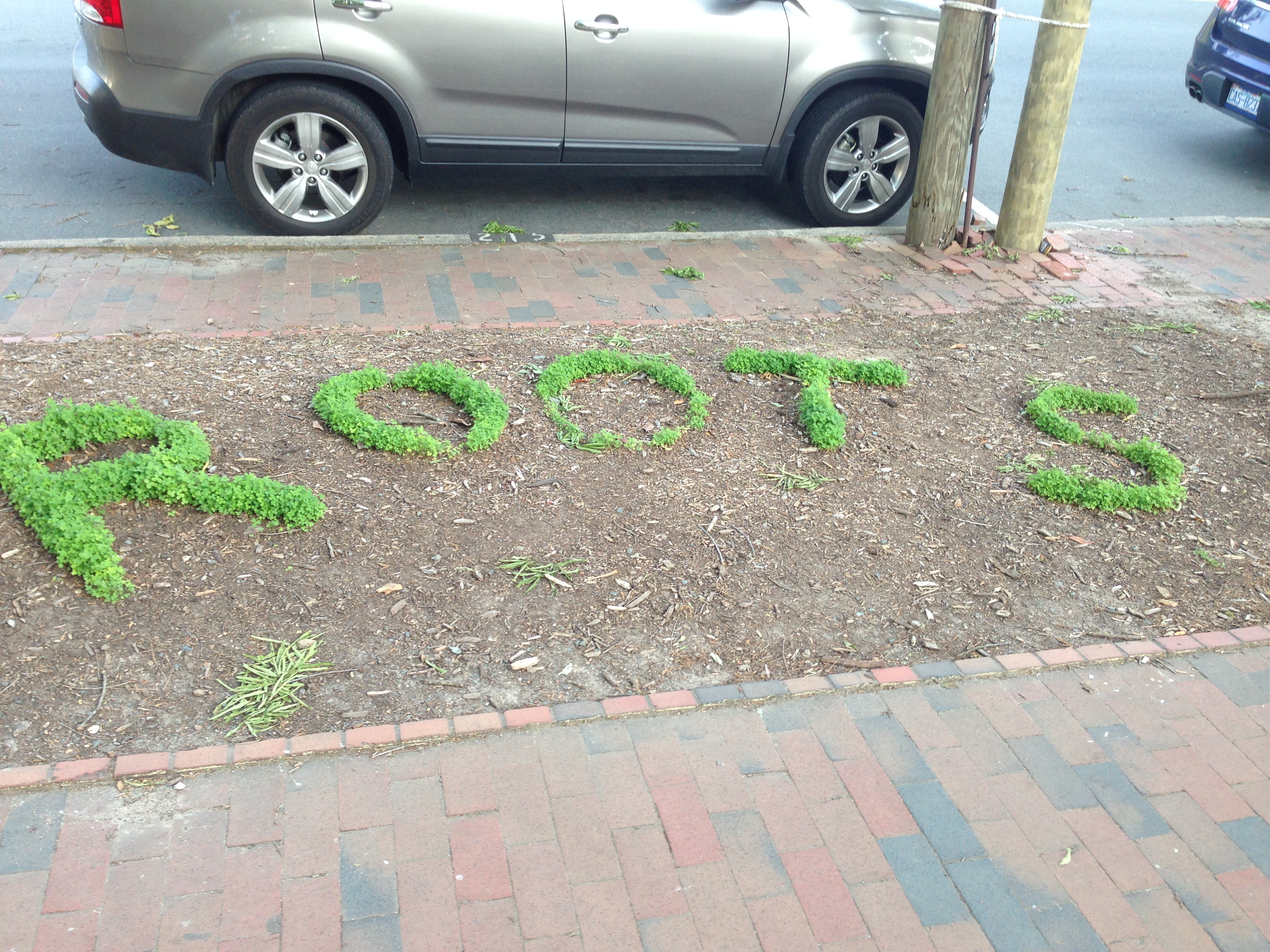
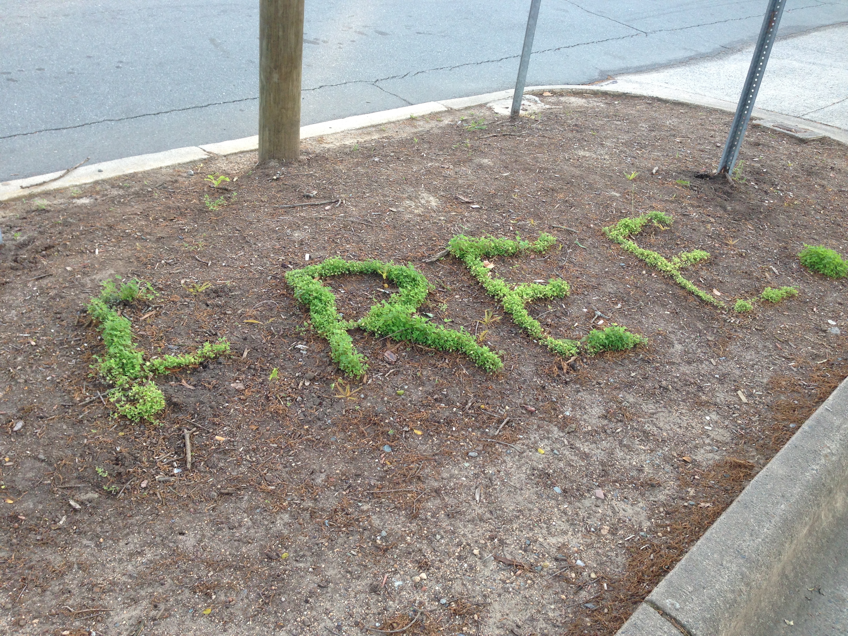
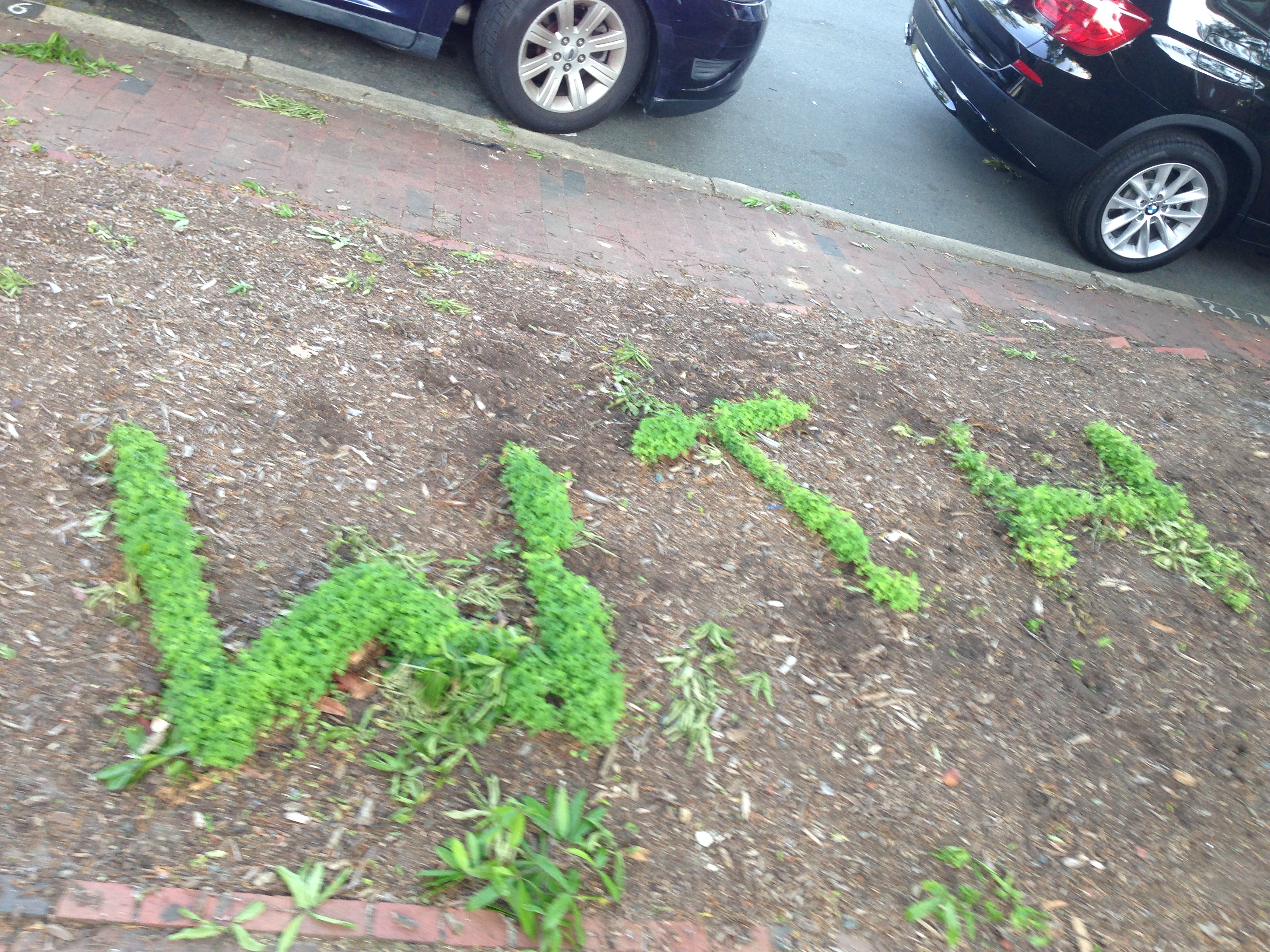
Over 1200 letters have been created so far and include a letterform set made of kale, French fries, tomatoes, vending machine food, and fresh summer vegetables. When a food alphabet is submitted to the Food Font site, an alphabet name and event information is inputted. This information will visible to users who will be able to use their own food alphabets as well as those made from about other individuals, groups, and businesses.

Food Alphabets are Free to Use

“I’m really excited to see what people will make,” said Baumlier. All Food Alphabets files are licensed with Creative Commons, which is a non-profit organization devoted to expanding the range of creative works available for others to build upon legally and to share. The Food Font images use the Creative Commons Attribution 4.0 International License, which allows anyone share, adapt, and use for any purpose, even commercially.

The Food Font alphabets have already been used by a variety of non-profit groups that include a hospital in the U.S., a cooking magazine in Turkey, a community garden society in England, and by a Danish food bank. Artists and entrepreneurs have also used the alphabets. Artist Shannon Castor used the Food Font letters to create t-shirt designs for her Etsy shop that includes a t-shirt that says “CORNY” on the front, made of the Food Font corn alphabet made by visitors to the Ingenuity Festival in Cleveland.

Baumlier is currently sharing the project with educators, farmer markets, non-profits, and others who might want to participate in either making a food alphabet that would become part of the project or would want to use the Food alphabets in creative ways. She also is scheduling some Food Font events for 2015.


For more information, goto FoodFont.com


tinySplash bigView – Here and Now

tinySplash bigView – Here and Now

How has media changed in the last four years?  In 2011 when I launched my new kristenbaumlier website, I was interested and felt a need to share about things that I saw and read about related to art, creativity, sustainability, and food.  I would goto an event or show, hear about a interesting social art piece, or read about something on the internet that was engaging and I wanted to share, and  tinySplash bigView was born.

I started tinySplash bigView with  a post on October 21, 2011 when I wrote about my experience of viewing a film screening for a film called Urban Roots. The name came from the idea that the blog was about engaging up-and-coming things, but written on my small independent media site.

For two years I posted 3-5 things each week, and sent out a bi-weekly e-newsletter that highlighted the best posts every two weeks.   In keeping up with the project, I felt as though I was “collecting” interesting things, and that by posting I was creating a collection of things that were so interesting I needed to share them.  By doing the blog, I got better and quicker at writing.  I also met a circle of other writers and bloggers and learned how quickly news travels.

I wrote a total of 440 posts over the past years.  Today some of the topics I wrote about are featured in mainstream media, and are now featured in radio, print, and online forums much more than a few years ago.

I have only written a couple of posts in the past year, and I am not sure if tinySplash bigView is done, but I am removing the logo from being at the top of the Blog/News area of this site.

I recently collected information about the “ugly vegetable” market that I might write about, but I wanted to post something about the beginnings of the project, and post something as I take down the logo.  tinySplash might not be visible as a name on this site but it is still here.


Chocolate That Explores Texture – Nendo Design

Chocolate That Explores Texture – Nendo Design

There are many flavors that  affect a chocolate’s taste including the chocolate’s origin, the percentage of cocoa used, the technique of how it was made, and the flavor inside.  One aspect of chocolate that is rarely explored is a chocolate’s shape.

Nendo, a Japanese chocolate company, recently designed a box of chocolates that explores texture.  Each piece explores a chocolate’s shape and has such qualities as spiky tips, smooth surfaces, empty interiors, or rough surfaces.

Each chocolate is named after Japanese expressions used to describe texture. The chocolates were designed for Maison et Objet 2015, a furniture show in Paris.

Here are the 9 names and descriptions of the chocolates:

1. “tubu-tubu” Chunks of smaller chocolate drops.
2. “sube-sube” Smooth edges and corners.
3. “zara-zara” Granular like a file.
4. “toge-toge” Sharp pointed tips.
5. “goro-goro” Fourteen connected small cubes.
6. “fuwa-fuwa” Soft and airy with many tiny holes.
7. “poki-poki” A cube frame made of chocolate sticks.
8. “suka-suka” A hollow cube with thin walls.
9. “zaku-zaku” Alternately placed thin chocolate rods forming a cube.

In looking at them – it seems that some of the surfaces and shapes would affect the experience – from feeling bubbly shapes melt on your tongue, to having to bite into spikes.

Texture is said to affect how saltiness and sweetness are perceived, so the 9 chocolates most likely would vary slightly in its taste due to the shape and texture in the mouth. According to TIC Gum’s research area, food and beverage product developers spend very little  time examining how texture may impact a finished product, which makes this design project a novel adventure.   (and also tasty!)

Images and Links:

Nendo

http://www.foodnavigator-usa.com


Get Rid of the Fear – Your Creative Elusive Genius

Get Rid of the Fear – Your Creative Elusive Genius

I recently watched a TED Talk by Elizabeth Gilbert, who talks about the impossible things we expect from artists and geniuses.  She is the author of Eat, Pray, Love – and shares about how how unrealistic it is that everyone expects someone who is creative and has had success – to basically fail or break down in the next endeavor.

She shares an interesting idea that, instead of the rare person “being” a genius, all of us “have” a genius.

I am currently in the process of moving the Food Font project into a different direction, and am also starting a new project.  I often will have moments of panic – when I think about my “audience”  for Food Font.  What will they think if I move to partner Food Font with a tool instead of finishing building one? What if I do not do any more Food Font events?

With my new project, I think about – what will I do with this new work, and why would I return back to making objects?

This talk helped give me some courage, and I quietly and steadily continue with my work.

elizabeth-gilbert-at-ted


Links:

https://www.youtube.com/watch?v=86x-u-tz0MA


Writing with Plants

Writing with Plants

This summer, some small plants started to appear on the side median of the street on Franklin Street in Chapel Hill, NC.  At first glance, they look like random tufts of greenery.  However, if you walk by slowly you are able to read words made of plants that line the street medians.

PLANT

PLAY

ROOT

MADE WITH

NOT L8R

are some of the plant words that were planted in areas that do not have any bushes or greenery.

I tried looking online to see if there was any information about the plant writing- but to date I have not found anything online.

Seed bombing? Public art?  Social intervention? Gardening?  Poetry? If you are in the Chapel Hill area – make sure you walk sideways as you go down Franklin street, to check out the writing with plants.


IMG_5888 IMG_5885 IMG_5879 IMG_5889