My works from Bliss: Salt, Sugar and Fat will be on display for the first time in the SWEET show at GreenHill gallery in Greensboro, NC. I am so excited to be part of the show, and to see the works on display.
In the show is 11 pieces from the Bliss: Salt, Sugar and Fat series as well as a set of the I See You, You See me, You Taste me Series.
Show details:
May 3 – July 14, 2019
Opening:
Friday May 3, 6:30 – 9:30
For more information, check out the event page of GreenHill gallery.
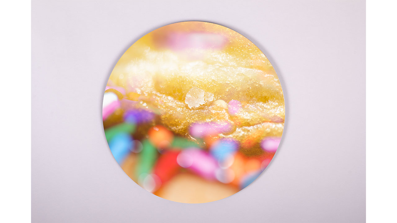
Donut

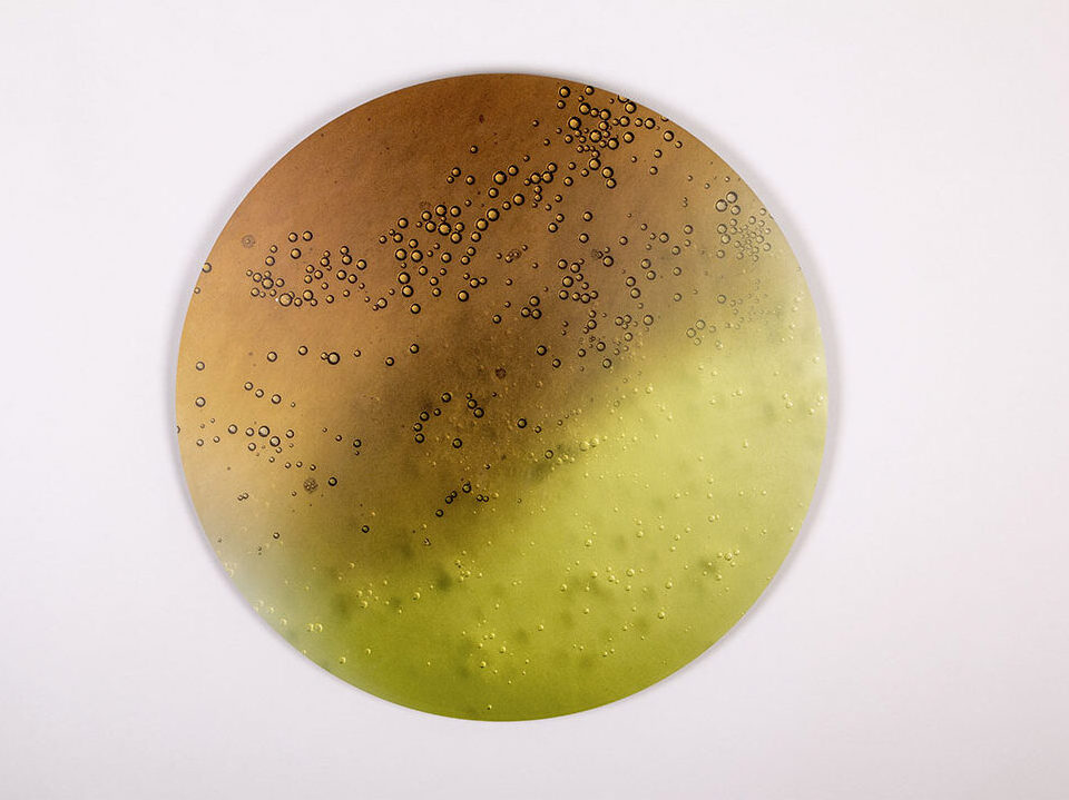
Coke meets Mountain Dew

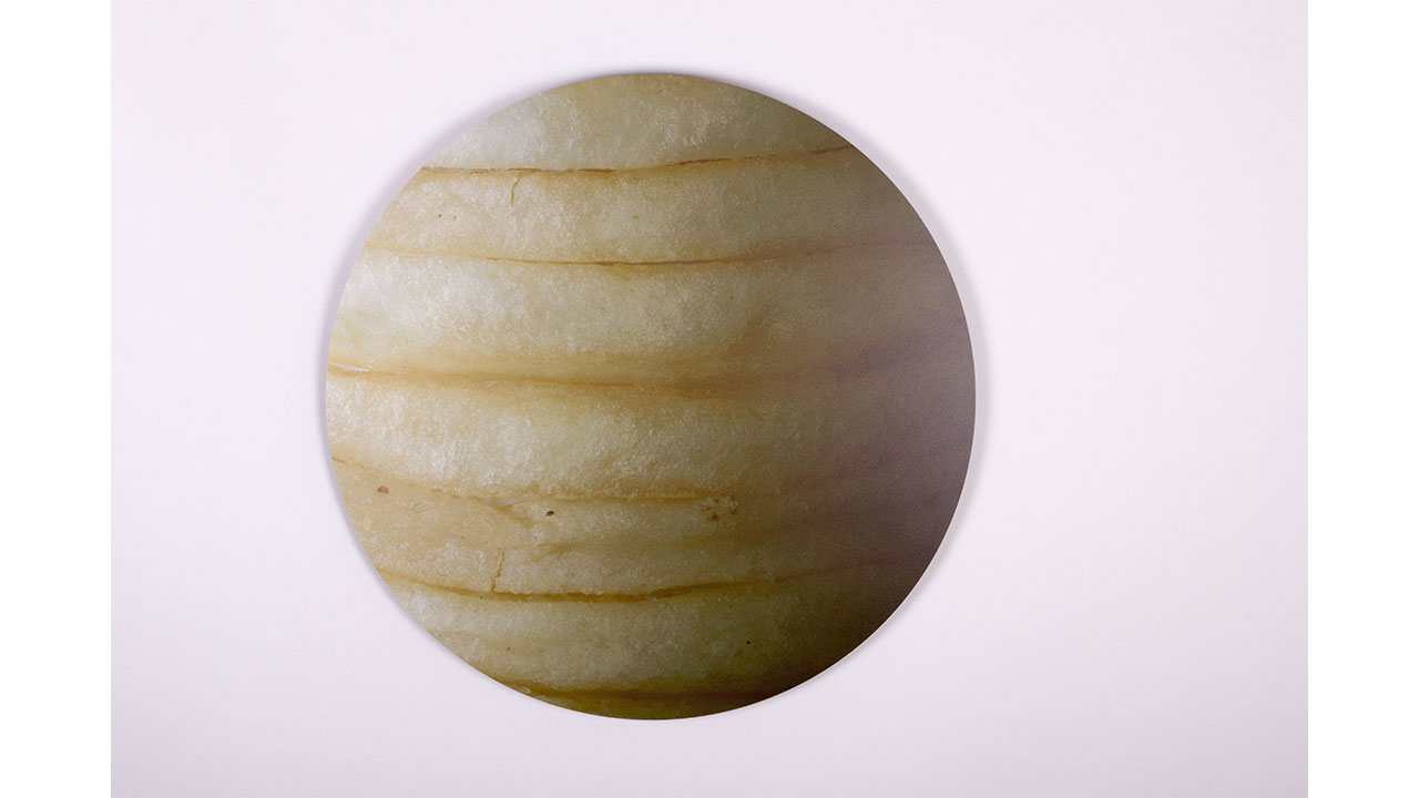
Salt
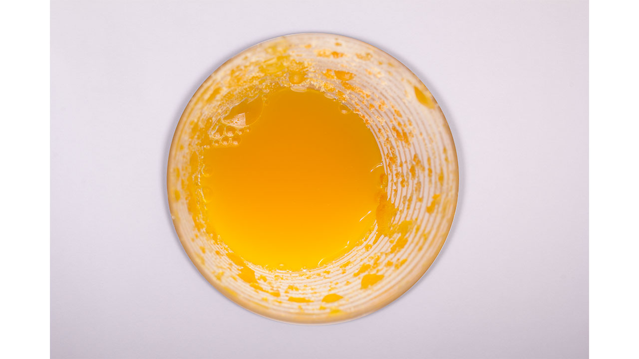
Tang

I see you, you feel me, you taste me : Hostess Cupcakes
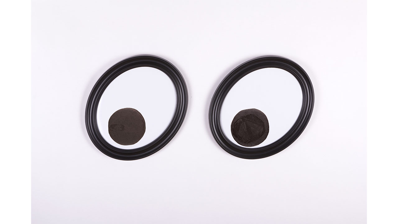
I see you, you feel me, you taste me: MoonPies